9 Tips to Improve Your Website Design: A Tweak & Edit Case Study — Part 1
Website design tips, for humans- not bots.
There are tons of posts about how to optimize your website for page-load speed, incorporate meta-tags, and maximize SEO keywords. While all that stuff IS important, this is not that post.
A major theme for us, what we’ve centered our whole business on, is helping you clearly communicate your work to humans, not bots.
It doesn’t matter how many people are funneled to your website via advertising or SEO tactics.
If the content doesn’t resonate or the website is hard to navigate—they’ll move on.
This post is the first in a two part series with fifteen website design tips you can implement on your own. You’ll see exactly how to communicate what you do and sell better with people who don’t know anything about your business—editors, future clients, and potential collaborators.
Using examples from our stellar Tweak & Edit client Thread & Whisk, you get actionable website design tips for the most important pages on any product-based businesses’ website.
You may be asking…wait, what is a Tweak and Edit?
So glad you asked!
The Tweak & Edit PR Review is our one-time service to help you improve your online presence.
Website pages included below
Homepage
About Page
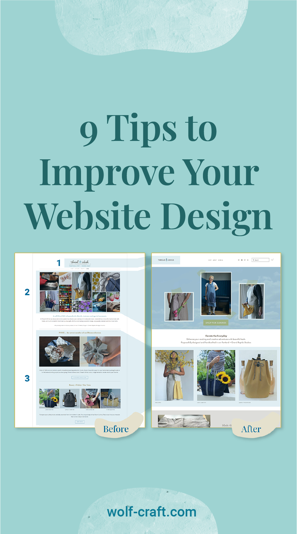
Unclutter your homepage
1. Modernize your branding and logo

Company logo before
The original logo for this website looks dated and leans “DIY/hobbyist” when compared to Thread & Whisk’s high quality products.
While their product and assets are good enough for media outreach, their website may not land well with the higher tier publications they want to pitch.

Company logo after
On the right side, you can see their new logo is cleaner, more modern, professional, sophisticated, and appeals to a wider audience.
When designing or redesigning your graphics, you want to be sure your logo reflects your businesses’ creative point of view.
2. Be sure your banner represents what you do or sell

Website banner before
Thread & Whisk is a company that sells high quality, US-made totes, aprons, and food accessory bags. However, this banner makes it very hard to understand who they are or what they sell? This could be a banner for a craft supply store, a DIY blog, or a product store.

Website banner after
This new banner includes very easy to understand product photography with clear CTA for the pictured item. The green call to action button is seasonal, stating “Shop for Summer”. This new banner is successful because it immediately communicates what Thread & Whisk sells and gives the shopper an immediate action to take.
Website design tip: your banner should clearly and beautifully show off your products or projects, because it is the first thing potential clients or editors will see when they land on your website. Think of it like your digital business card.
3. Use large, clear images

Product section before
As humans we’re mega distracted and too much visual information is overwhelming. The long product section on the left is busy with graphic elements — tan headings, text, lines dividing each section, outlined buttons, and a lot of small product images. This amount of elements makes the page feel busy and a new visitor won’t know what to focus on, plus all these tiny images aren’t showing off the products as well as they could.

Product section after
The paired down and improved homepage includes three simple large, clear, well-photographed images of three product types. The images here are clickable, further reducing the amount of information on the page and truly making the images the star of the show.
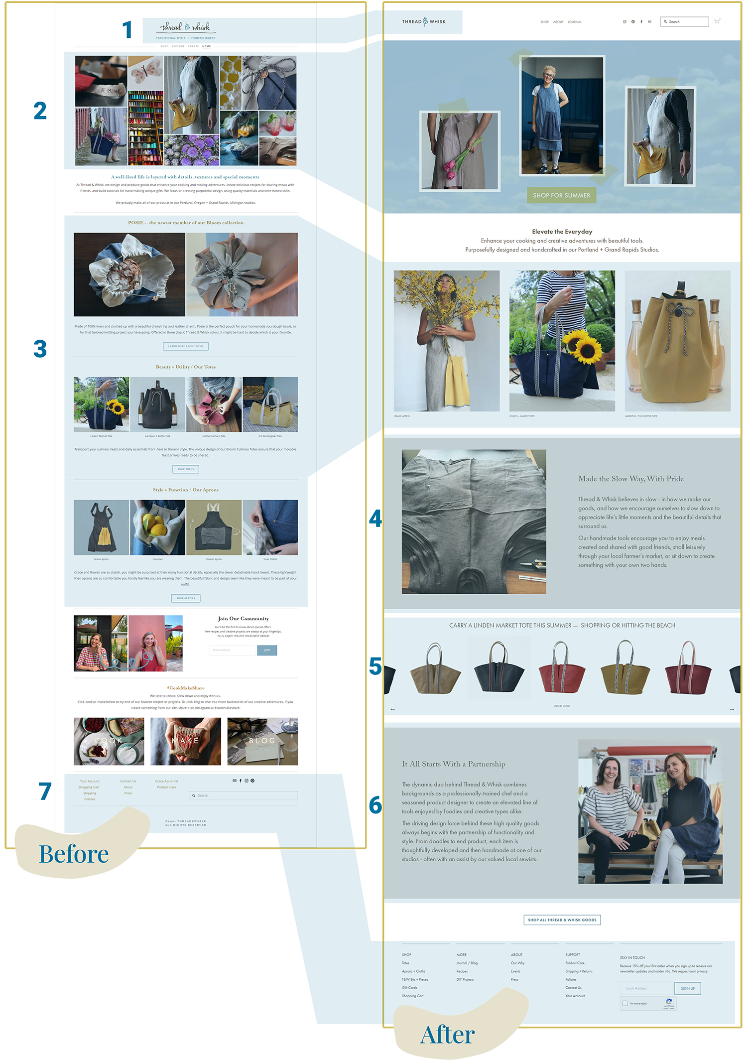
4. Share your company’s values — homepage addition

“Made the Slow Way, With Pride”
People like to purchase from brands who they connect with, likewise editors write about brands who will resonate with their readers. If your products are made sustainably, if you have a program where you give back to your community, or if you source materials locally, for example, tell us! You want your potential customer to see themselves in the copy you write.
The second paragraph in this section says “Our handmade tools encourage you to enjoy meals created and shared with good friends, stroll leisurely through your local farmer’s market, or sit down to create something with your own two hands.”
This copy is successful because it describes settings that someone will immediately visualize while mentioning the products Thread & Whisk sells. Improving your website design isn’t just about the graphics and images, it’s about the copy too!
5. Promote seasonal items — homepage addition

Individual product feature
We are big seasonal section enthusiasts. This is our PR experience talking. Editorial calendars are organized around seasons and seasonal events — think back-to-school, the holidays, mother’s day, or “spring cleaning.”
For Thread & Whisk this section is titled “Carry a Linden Market Tote this Summer”. Of course, you can also use a tote in the winter or fall but they are connecting to their audience again by talking about what’s happening right now. Using a similar logic, they could include a section about their apron in the Fall with a title like “Wear the Grace Apron for all Your Holiday Baking.”
Website design tip: if you have a wide array of products, we suggest you choose one product or line per quarter to highlight in an individual section. If you can connect this back to the season, even better!
6. Tell us about you — homepage addition
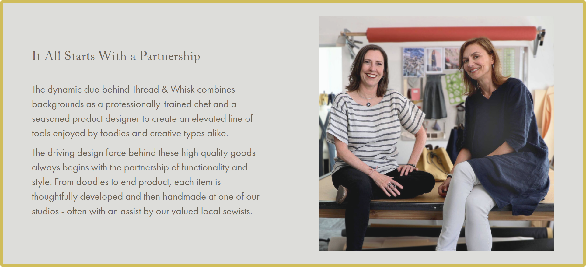
“It All Starts With a Partnership”
Similar to website design tip 5, more and more people like to purchase from businesses they connect with.
Around fifty-percent of your website traffic will initially land on your homepage and many of these visitors won’t click over to your about page. So, if you have a founder story (most small businesses do!) consider including a small section on your website’s homepage that gives a new visitor a bit of your unique backstory. Bonus points for a great founder photo, like this one of Carey and Meri.
7. Streamline your footer

Website footer before
If someone has scrolled to the bottom of a page on your website, your footer is another opportunity to clearly communicate what you sell or your services. The original website footer includes important business information like shipping policies, product care, and contact information but it doesn’t include any links to the actual products they sell. This is a missed opportunity.

Website footer after
Thread & Whisk’s improved website footer design includes links that are organized under four clear categories - shop, about, support, and more. All the main pages on their website are also linked here. A new visitor can easily access their shopping cart, get more information about product care, read Thread & Whisk’s blog, or navigate to a product page.
About Page
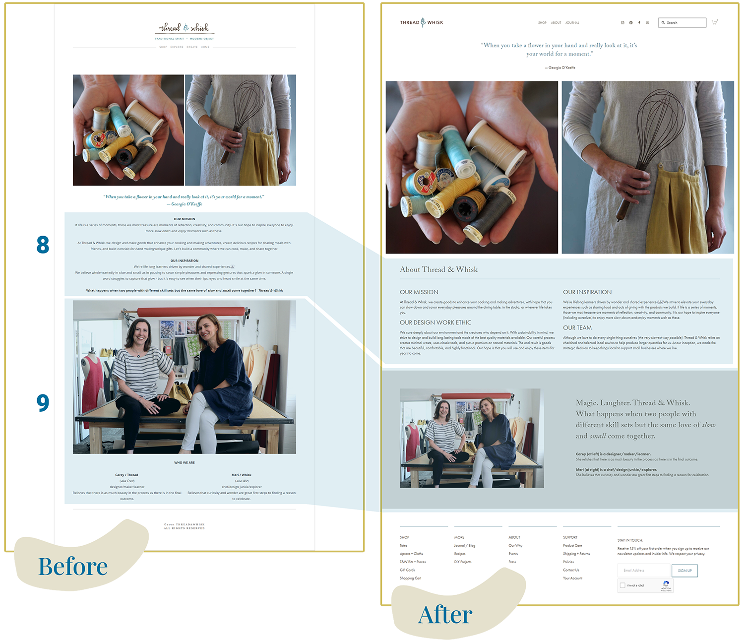
8. Tell us your business ethos

“About Thread & Whisk” before
Thread & Whisk’s initial about copy included sections on their mission and inspiration, but this initial copy was missing information about how the products are actually made and where. If your pitching editors at local publications or round-ups of locally-made products this is important information to include on your about page.

“About Thread & Whisk” after
Thread & Whisk’s improved about copy includes a section where they talk about their commitment to sustainability and high quality long-lasting goods as well as a section where they tell us about their team and who makes Thread & Whisk products.
9. Show your personality

“Who we are” Before

“Who we are” after
Overall Thread & Whisk’s initial about page was strong and a few small adjustments made it even stronger. One of the things we liked the most — and a suggestion we give to creative businesses all the time — was their great founder photos.
Website design tip: your founder photo is another important opportunity to show off what you make and your creative point of view. It should be taken by a professional photographer in-situ, ie in your studio, shop, work-space, etc.