7 Tips to Improve Your Website Design: A Tweak & Edit Case Study — Part 2
Website design tips, for humans- not bots. Part 2.
Did you catch Part 1 of this series? Read 9 website design tips for your Home and About page here.
This post is the second in a two-part series that walks you through sixteen specific and actionable website design tips for the most important pages on any product-based businesses’ website.
These website design tips are centered on how to communicate what you do and sell better with the people who come across your website for the first time and don’t know anything about your business — editors, future clients, and potential collaborators alike.
Website pages included below
Main Product Page
Individual Product Page
We built this series using before and after shots from our truly stellar Tweak and Edit client Thread & Whisk. The Tweak & Edit PR Review is our newest service, created to help you improve your online presence.
Main Product Page

1. Remove distracting graphic elements

Shop page header before
Similar to a tip we gave in Part 1 about modernizing your logo on your homepage, we also suggest removing any clip-art style graphic elements that are distracting or take the focus away from your products.

Shop page header after
The header for this updated shop page is clean and professional.
The graphics don’t distract from the high quality product photography on the page.
Website Design Tip: Often businesses that sell online think hyper-stylized logos and extra graphic elements will enhance their brand identity.
This may be the case if you work with a great experienced graphic designer, BUT if you are DIYing your own website or using limited help, our suggestion is the simpler the better. Focus your creative impulses on taking stellar product photography.
2. Streamline product navigation

Product navigation before
On Thread & Whisk’s previous “shop all page” a visitor would have to scroll through the whole page to see the different product options, listed under small unclickable headings.

Product navigation after
The improved and simplified “shop all page” includes a simple, easy-to-use side navigation where someone can quickly see ad click to their main product categories - Totes, Aprons + Cloths, T&W Bits + Pieces, and Gift Cards.
3. Make your main shop page image-first
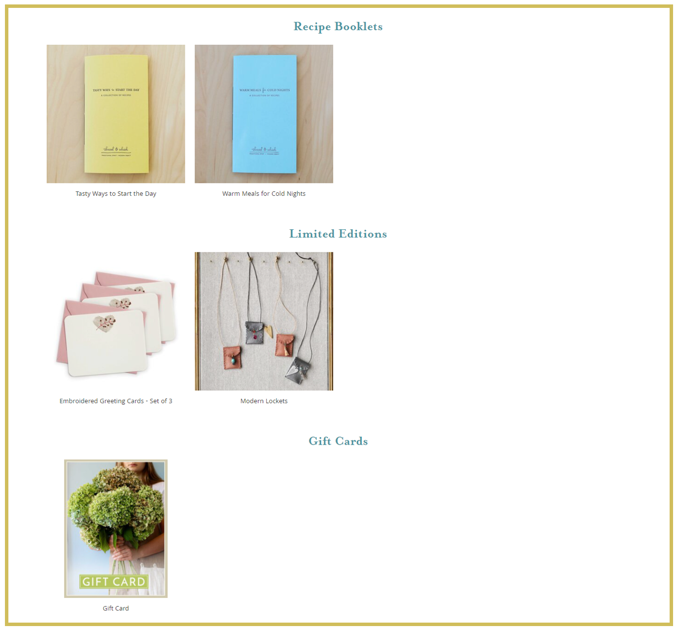
Main shop page images before
The images on this before page are small, not standard (ie- some fill the whole square and one is solo-against-white). and the layout includes a lot of wasted white space. Overall the images are not the most compelling element on the page, and they should be!

Main shop page images after
This is the most important tip for your main shop page. Humans are visually oriented — as long as it doesn’t get cut off — the larger the image the better. One great large product image is always better than four tiny images.
As you can see in this after screenshot the images are almost twice as large as the original page.
Website design tip: When choosing images for main shop pages include the shots that show off your full product.
If you’d like to include an interesting detail or the back of the product, for example, consider having the image switch on rollover. You can see this in action by clicking over to Thread & Whisk’s shop page.
Individual Product Page

4. Use breadcrumb navigation

Navigation: Shop > Grace Apron.
A small but very effective tactic, breadcrumb navigation.
Most product-based businesses organize individual products under bucket categories. In this example aprons. If a visitor is shopping for aprons and clicks to one model specifically, breadcrumb navigation allows them to easily click back to other apron options.
For website platforms like Shopify and Squarespace breadcrumb navigation is built into shopping pages and should be an option that you can easily toggle on and off without any extra formatting or coding work.
5. Left justify paragraph text
Paragraph text before
Center-justified paragraph text works well for headings but is hard to read for paragraph text, especially when it is longer than three lines.
However for paragraph text, the ragged margins on both sides of center-justified text make it hard for the human eye to jump from one line to the next.

Paragraph text after
We all learned how to read from a young age with books and paragraph text in books is always left-justified.
This means from a young age our eye was trained to jump from one line to the next by looking for a straight left margin.
6. Be sure product add-ons are clear

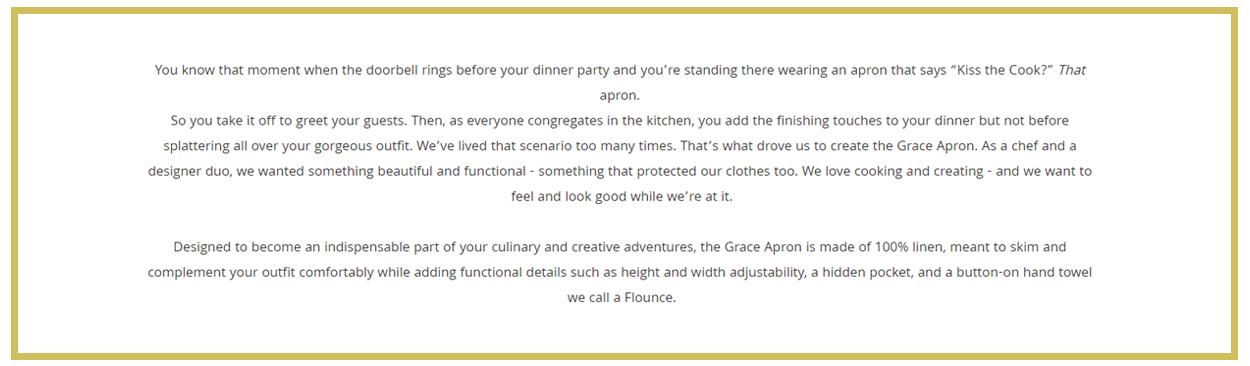
“What’s a Flounce” before
If you purchase an apron from Thread & Whisk, you have the option to purchase one or more Flounces, ie an extra hand cloth that is buttoned to the apron. However, in the original product page the individual solo-white image of the Flounce makes it a bit hard to understand what it is. The color options are also in a separate area toward the top of the page.

“What’s a Flounce” after
Here you can see that a few small tweaks made a big improvement.
This updated section includes a super clear image of the Flounce in use pinned to the apron as well as the color selection for this add-on.
7. Optimize your suggested products section

“You Might Also Like…” before
If you sell products including a “suggested products” section at the bottom of each individual shop page is a great way to keep people on your website a bit longer and introduce them to items they may not have seen yet. However, Thread & Whisk’s original suggested products section only includes one image and it is quite small, not doing all it could to guide the visitor to other pages.

“You Might Also Like…” after
The improved suggested products section includes three super clear large images that may appeal to someone who is on the shopping page for an apron.