Tweak & Edit PR Review
A video teardown that shows you what to fix for press & growth
⬆ Check out how it works ⬆
Your content should help your business grow.
But sometimes you’re not sure if it’s working. That’s where your Tweak & Edit PR Review comes in.
We use our PR-tuned eyes to show you *exactly* where to tweak & edit the content you’re already making. By content, we mean your website, social media, newsletter, press pitches, and photos. Anything public facing.
Our goal for you: when potential clients come across your business, there aren’t any roadblocks to making their purchase or they think “I’d love to work with this team!”
Likewise, when editors see your stuff, they think “These images are stellar. I can’t wait to publish this work!”
A Tweak & Edit will set you up for growth + PR success!
After following our advice…
Interior Designer Laura Krey tripled her Instagram following in four months. AND increased her newsletter open rate by 14%!
Wallpaper designer Faye Bell secured top media placements, including domino, ADPro, Azure, Business of Home, CA Home + Design, & more!
Knotions, a crafting site focused on knitting and crochet, saw a big uptick in sales for their monthly membership program.
Why we built the Tweak & Edit PR Review?
We’re Nora and Kirsten. We’ve spent years helping creative businesses use PR to get noticed. Along the way, we realized something important: not every business has the resources for a full PR strategy, BUT every business does have a story worth sharing. A small budget shouldn't hold you back. That’s why we created the Tweak & Edit PR Review.
Many brands come to us frustrated. They’ve been trying to get press or boost sales, but haven’t seen the success they were hoping for. Often, they don’t realize what is missing before those big wins can happen. These are the kinds of things you only know when you’ve spent years working in PR.
With over two decades of experience in PR and strategy, we know how small changes—like sharpening copy and photography, or fine-tuning a newsletter—can have a big impact. We wanted to take everything we’ve learned and offer it in a simple, approachable way.
When you receive your Tweak & Edit, you’re not just getting edits—you’re getting years of PR know-how and a team that’s rooting for your success.
A Tweak & Edit PR Review will help you:
Steer clear of common content slip-ups. The ones that hold you back from growing your brand, getting press, and selling more.
Tell your story more effectively so you stand out in a crowded market.
Fine-tune your visual assets and copy so they catch the eye of potential clients and editors alike.
Understand what works, and what doesn’t when it comes to digital content.
And since our T&E is custom-to-you, that list above is just the start!
Our advice is always specific to your business, your struggles, your goals.
You probably need a Tweak & Edit, if:
You suspect that your website could do more for your business—we’re talking more sales and more clients
You’ve seen your peers featured in the media. You're itching to know what to do to get that great press for your business.
You spend A LOT of time on your Instagram and Newsletter, but still aren’t sure if you’re headed in the right direction.
You want a PR professional to look at your work and tell you *exactly* what to fix
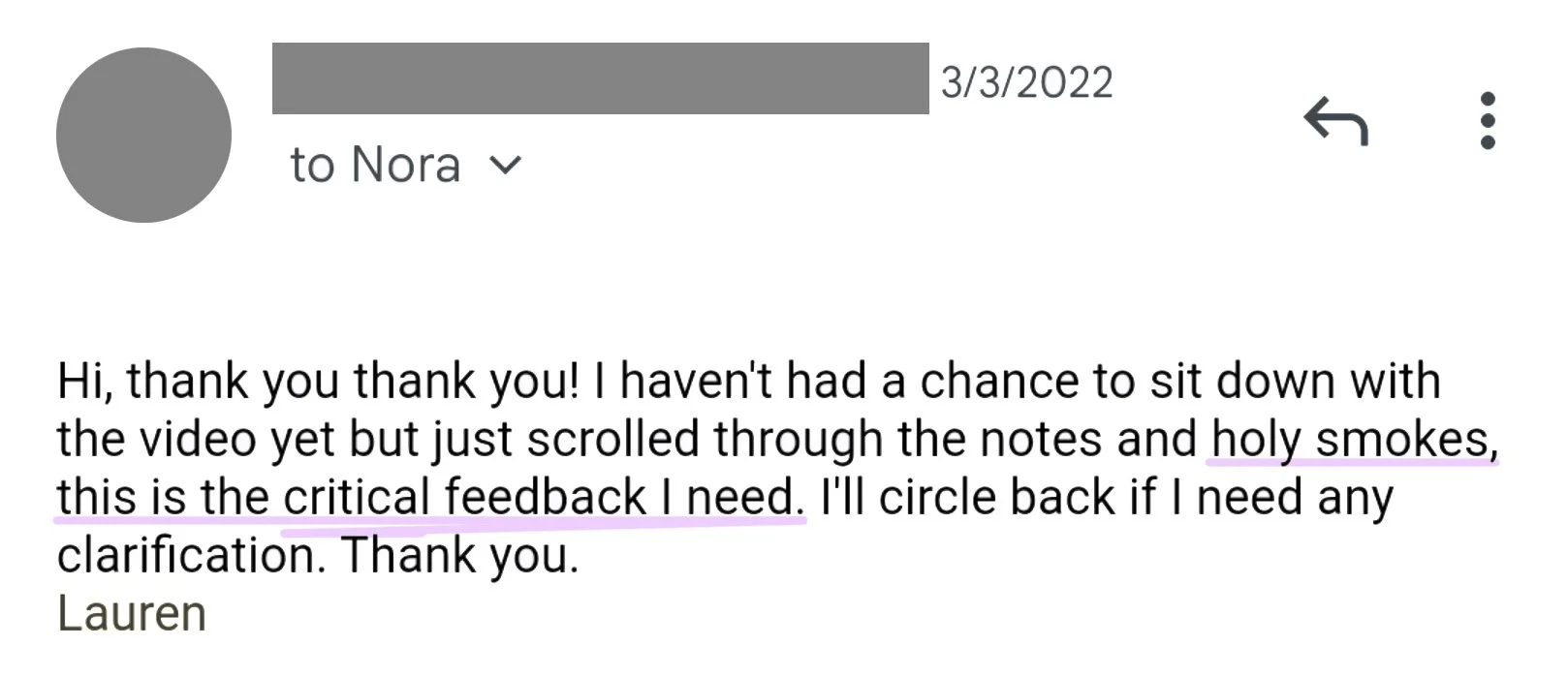
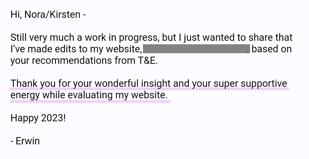
Feedback from a recent client:
How a T&E has helped businesses like yours


You’ll get video feedback on your:
Photography
Creative industries are visual-first. Media-quality images are the most important element if you want to get press for your work.
We review your photography to give you actionable tips on capturing your work, products, projects, services, and process.
You’ll also get best-in-industry reference images.
Structure & Wayfinding
When an editor or potential client lands on your site you have seconds before they decide to stay or move on. How you structure your homepage and navigation is key to ensuring visitors stick around.
You’ll get clear tips on how to use navigation and wayfinding to describe what you do and guide a new visitor through your site.
Copy
We read all the copy on your homepage, about page, project or product pages, as well as things like blog posts, trade pages, and FAQs.
You’ll get specific advice on where and how to improve your copy with links to best-in-industry examples.
Where relevant, we’ll also advise you on how to position yourself as a thought leader in your field.
Social Media
Each Tweak & Edit PR Review includes a review of one additional platform, like Instagram, Pinterest, or LinkedIn.
You’ll understand how to leverage social media for your business growth and PR goals.
You’ll get advice on things like, how to improve your profile, tell a compelling businesses story, and share news and new projects.
Your Press Goals
Often, clients and editors are looking for slightly different things from your website. If you want press, you’ll have to appeal to both.
We draw on 17+ years securing press placements in design publications to give you tips on how to appeal to editors. This includes examples of publications that are a good fit for your business and story angle tips.
How to Stand Out
Everything we do is grounded in a research-based approach to PR and content strategy. The Tweak & Edit PR Review is no different.
Your T&E review will include examples of best-in-show websites and content so you understand what’s working in your industry and why.
More happy Tweak & Edit Clients

Tweak & Edit PR Review
Who is it for?
Product-based brands and businesses, like ceramicists, jewelry brands, and home goods companies.
Independent artists and designers, like wallpaper, furniture, and lighting designers.
Interior design and architecture firms
Any creative business looking for actionable advice to improve your web presence
How it works?
You fill out a form with your PR and website goals and struggles, a specific project that you want us to review, and a link to one additional platform (Instagram, newsletter, LinkedIn, etc.).
We review your website, assets, and PR goals page by page to make a detailed outline of feedback including best-in-industry examples.
Our review is driven by goals and struggles you identified.
What you get?
A 30-45 minute video with actionable advice on topics like: your PR goals, how to communicate what you do, website structure, visual assets, launching new products, etc.
A detailed written outline of feedback and tips including links to reference websites and content.
You and your team have lifetime access to the video and notes.
FAQ
-
Your Tweak & Edit PR Review is a one-time fee of $925, this includes lifetime access to your review video and detailed notes.
One client let us know that the T&E was the best money she had ever spent on her business. And she went on to get featured in top-tier media outlets!
-
You will be able to implement many of the suggestions we make immediately, like adjusting copy, re-ordering images, or streamlining navigation. The goal of the Tweak & Edit review is to give you super clear actionable suggestions that you can implement within the existing structure of your website without having to start from scratch.
-
YES! Your review includes a 20-30 minute video that you can access online as well as download. It also includes a Google Doc with detailed notes and reference links. You have lifetime access to all of this material.
-
The Tweak & Edit PR Review is for one business and one associated social media account. If you have more than one business (so many creatives do!) and you’d like us to review more than one website you can purchase two or more individual reviews.
-
Typically we can turn around your Tweak & Edit in two weeks, and often in just one week. If we are extra busy, it can take up to three weeks. If we are in a particularly busy moment we’ll be sure to let you know right when you sign up.
-
YES. Just send us an email after signing up to let us know when you’d like to get started. We’ll be sure to put it in our calendar so you get first priority once you’re ready.
-
After purchasing your T&E we’ll send you a confirmation email with a link to a short intake form. You’ll use this form to tell us more about your biz, priorities for review, as well as your PR goals and struggles. We start the review after we’ve received your intake form. You must complete the form within one month of purchase or you will lose your T&E slot and we will not be able it issue a refund.
-
The review does not include an additional call, but if you have follow up questions and want to chat through strategy a bit more after getting the video you can set up an hour-long 1-1 call for $250.
Tweak & Edit Reviewees Get Results
Homepage - card game, Rock Paper Scissors Wizard Croc
Before
An extra-long homepage that is bogged down with too much throw-away information. Photos (especially the banner!) don’t highlight the product.
After
A well-organized, clean, compelling homepage optimized for purchases and to show off the card deck.
Homepage - self care brand, Hear I Am Box
Before
A generic, forgettable homepage with lackluster images that don’t showcase the brands high-quality products and gift boxes.
After
A stand-out homepage with compelling images, clear copy, on-brand graphics, and well-organized sections. Highlights their key product—gift boxes.
Product page - self care brand, Hear I Am Box
Before
A generic product page with too much info packed into the standard description section. Page does not showcase the value of the product.
After
Compelling product page that highlights the benefits of this Body Bar, showcases the brand’s values, and introduces related products.
About page - lighting design, Elish Warlop
Before
From the formatting, to the bio image—this doesn’t feel like an about page for a designer. It’s doesn’t highlight this designers process or unique POV.
After
Compelling about page with design process images, an on-brand profile photo (with the product!), and specific made-in-america section.
Project page - architecture firm, NDNY
Before
A hard-to-use project page that requires the user to click through each image. Distracting graphics and layout take away from the work.
After
A clean scrollable page that foregrounds the most important thing—stunning project images. Graphics + fonts are clean and aligned.
Services page - lighting restoration & fixtures, Aurora Lampworks
Before
An information-dense, hard-to-read services page that lacks images to help the reader understand Aurora’s process, skills, and experience.
After
A well-organized, clean services page that utilizes each section as a portfolio opportunity to showcase Aurora’s skills and experience.
Collection page - heirloom fabric, Sew Vintagely
Before
An extremely messy category page that makes the brand feel unprofessional, and thus, untrustworthy.
After
A professional, compelling category page with consistent, high-quality product images.
Homepage - wallpaper & textiles, Lea Rutledge
Before
A busy homepage that doesn’t highlight key products from this designer’s line.
After
An homepage that foregrounds key product categories while still remaining on-brand.
Product page - designed objects, Nikki Alagha
Before
A simple, minimally-formatted product page that feels more like a student portfolio than the work of an up-and-coming designer.
After
A professional, engaging product page that highlights key details, professional photos, and a unique manufacturing process.
Trade page - hardware & jewelry, Marion Cage
Before
A lackluster trade page that doesn’t showcase the unique and broad range of products available to interior designers.
After
A stand-out trade page with compelling copy, stunning product images, and key information for potential design partners.
Collection page - ceramics, Lauen HB Studio
Before
A basic collection page that is not optimized for shopping. It requires too much clicking for the user to learn more about each product.
After
A collection page optimized for shopping, including: category sorting, product titles, ratings, price, and an SEO description for the collection.
Homepage - home goods, Thread & Whisk
Before
A homepage where they layout, graphics, and images distract from the stellar product images, which are far too small!
After
A clean, on-brand homepage that showcases Thread & Whisk’s products, with big images and minimal graphics.


