How to Make Sure Your Logo Reflects Your Creative Business
We’ve been reviewing A LOT of websites recently. Logo design keeps coming up as a topic that people are interested in. It also often happens to be an element that many creative businesses can improve. In the spirit of giving the people what they want, we dug through our spreadsheet of great websites to surface logo design inspiration that will help you understand how to make sure your logo reflects your creative business.
A logo is not going to make or break a press moment. But, it is another touchpoint that shows how you think about design, how seriously you take your business. If you have an outdated, blurry logo, it’s hard to inspire confidence with an editor, customer, or wholesale partner.
Your logo shouldn’t be an afterthought. It should be intentionally designed to reflect your point of view as a brand.
We love a Show, Don’t Tell moment, so to give you concrete examples, we’ve surfaced logo design inspiration from twelve creative companies across textile design, ceramics, architecture, lighting, furniture design, fine art, and accessories. Stylistically, the logo designs below range from contemporary and fun to classic and sophisticated.
1. Bold graphic logo design with Block Shop
Block Shop is an LA-based textile, art, and design studio founded by sisters Hopie and Lily Stockman. They’re dedicated to the rich history of handmade textile production while keeping their designs and patterns fresh and contemporary.
Block Shop’s logo design reflects the geometric nature of their patterns, and is fresh and graphic. The letters are composed more like shapes than words, however the name is still totally legible. If you head over to their site there’s also a fun little animation when you hover over the logo.
2. Lettering inspired by ceramic shapes with Caudex
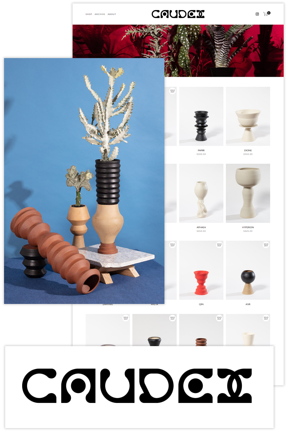
Caudex is a ceramic vessel shop based in New York City that makes wheel-thrown planters. For NY-based buyers they also offer pre-planted, quirky, uniquely-shaped plants to compliment the the forms and colors of the vessels.
Caudex’s logo feels like the logo of a ceramics brand, the letters rounded and organic. They’ve extended the exploration of shapes present in their work to the creation of their logo’s letters, which look like they could be inspired by section cuts taken through their vessels.
3. A hand drawn logo and lettering with Coco Dável
Coco Dável is a multidisciplinary artist who works across painting, photography, and art direction. Her colorful work has been exhibited all over the world and she has collaborated with brands and companies ranging from Chanel to Netflix to Puma to Nespresso.
A quick look at the homepage of Coco Dável’s website and you’ll notice not only the bright saturated color palette but also her presence in the documentation of all of the work, be it jewelry, textiles, or portraits in her painting studio. Coco Dável’s logo, which feels like a painted signature, brings this ‘artists presence’ into the graphic language of her website and branding. This custom hand-painted font was also used for the title of her first book Faceless.
4. A uniquely animated logo with East Fork
East Fork is a ceramic dishware with roots in vernacular North Carolina folk pottery. Their growing team of 100 people is based in Asheville and their dishwasher-safe plates, mugs, cups, vessels, and bowls are made from regional materials. If you’re from the ceramics world you probably already know about East Fork, their fans are FANS, and when new glazes are released the pieces often sell out in hours.
The font used in East Fork’s logo has a time-worn, handcrafted, folk feel, you can imagine it engraved in a weathered wooden sign hanging above a barn or farmhouse. What we love most about East Forks logo is how it is animated on their website, sketches of their dishware slowly swapping out the space of each letter.
5. Graphic architecture-inspired lettering with Folk
Folk is an Australian architecture studio located in West Melbourne, founded by Christie Petsinis and Tim Wilson. The studio designs a range of projects from homes, to a winery, gallery spaces, and yoga studios.
We like how Folk’s logo references architectural forms without feeling gimmicky. And although the logo is comprised of shapes, the word Folk is still easily readable even when the shapes are composed as a square. In a sea of architectural ‘logos’ that simply use Helvetica or another easily accessible font we appreciate Folk’s attention this part of their creative practice.
6. A new take on a classic form with Flamingo Estate
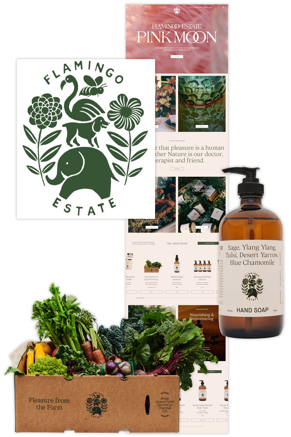
First founded in the hills outside Los Angeles in the 1940s, Flamingo Estate now sells botanicals, organic produce, art publications, and handmade goods produced sustainably on the estate and by local craftspeople.
Flamingo Estate’s logo is a play on the composition of old-world champagne logos and is prominently incorporated into the packaging of all the goods produced on the Estate, right down to the cardboard box used to deliver organic produce. We like this contemporary take on a classic format. The logo isn’t too rigid or formal, and looks like it could even be a hand-carved stamp or block print. Its elements are a nod to the biodiversity of the estate.
7. Classic elevated logo design with ORRIS
ORRIS is a small-batch artisanal botanical soap brand produced in France from sustainably-sourced ingredients. From their about page “We believe cleansing is an integral part of any skin care regiment and should be a luxurious and indulgent experience.”
We’ve seen dozens and dozens of sustainable, organic self-care products, whose branding can so often lean granola hippy, and not in a good way. What we love about ORRIS’s branding and logo is how classic and elevated it is. They mention skin care as a luxurious regimen and their logo looks like one of a luxury brand. It is also simple enough that it can be easily stamped into the soaps themselves.
8. Pattern inspiration with Malene Barnett
Malene Barnett is a multi-talented artist, designer, activist, speaker, and “authority on the cultural traditions and practices of art in the African diaspora and how it translates into her vision of the modern black experience.” She is also the founder of the Black Artists + Designers Guild and dedicated to opening doors for the next generation of black artists.
Drawing upon her extensive travels and memories of patterns from around the world, she utilizes patterned motifs across all mediums of her work. Malene’s logo also references a paired down version of the various triangle motifs from her work. It is minimal while still embodying her artistic point of view.
9. Minimal logo design with VIDIVIXI
VIDIVIXI is a design firm based in Mexico city and founded by Mark Grattan with Adam Caplowe. They create contemporary seductive and rigorously crafted furniture, which is constructed with both a simplicity and extreme attention to detail.
We wanted to highlight VIDIVIXI’s logo — which like the objects it represents — is minimal yet meticulously designed. It isn’t trendy or playful, but classic, like the logo of a design firm that will be around for several more decades.
10. Product incorporation with Ocrum
Ocrum is a New York-based furniture, lighting, mirrors, and decorative accessories studio founded by Sean Zhang whose minimalist lifestyle informs much of their design work. “Ocrum draws inspiration on both vivid memories and the wonder of time, merging classical sensibilities with bold innovation and craftsmanship.”
Ocrum’s logo is one of the best examples we found of how to beautifully and simply incorporate what you design or make — lighting in this case — into an actual logo. This logo is simple and minimal like the work Ocrum creates.
11. Classic with a twist with Legendar
LEGENDAR creates classic high quality “objects for daily use” like, brass pens and pencils, leather cases, document folders, and mousepads.
LEGENDAR’s logo, like the products it represents, is classic and sophisticated. It is also another example of a logo that is animated as you scroll down their homepage. The diamond-shaped graphics, which are incorporated into the E and A shift to become one simple graphic. This shape is also stamped onto their leather goods and onto the end of their pens and pencils.
12. Nostalgic logo design with Partners
Partners Coffee Roasters (formerly Toby’s Estate) is an independently-owned, small-batch coffee roaster headquartered in Brooklyn, New York. Partners coffee includes a wholesale business, online shop, and five neighborhood cafes. They are striving “to make sophisticated and complex coffee as approachable as possible.”
Nostalgia and approachability are difficult too achieve without feeling cheesy or trying to hard. That’s why we’re such big fans of Partners Coffee Roasters’ logo. The long T cross and thick cursive letters almost feel like an old diner logo. But, the single flat color and lack of extra graphic elements like borders or background shapes ensure that this logo is a bit nostalgic but still quite contemporary.


