two furnish
Telling compelling stories of creativity and value add for a not-so-traditional furniture dealership
“Wolf Craft is an amazing partner for marketing and sales teams who need high-quality support, but can’t hire more people. They quickly understood our goals and were completely self-directed on new initiatives.
For each of our marquee projects, they managed interviews and asset gathering with teams across our company to create content that articulates our creativity and value-add to build our brand. The material they created supported a wide range of marketing and sales channels, including case study pages, social media, newsletters, and RFPs.
Plus, Nora and Kirsten are fabulous and fun to work with, which made collaborating even better.”
— Paul Mabe-Foggm, A+D & Marketing Strategist at two*
Services
In-depth Industry Audit
High-impact Website Updates
Ongoing Project Page & Blog Post Creation
Newsletter Development & Management
Social Media Content: Instagram, Pinterest, LinkedIn
Industry
Contract Furniture Dealership
Interior Design
—
—
two is a San Francisco-based contract furniture dealership. They partner with interior designers on commercial projects of all scales. For each project, two’s seasoned teams curate the perfect mix of furniture and decor items, including designing and sourcing custom pieces.
The Challenge
No system for surfacing new work, leading to generic content that did not highlight two’s strengths and actually made two look… boring. Their content was also years old and they had no procedure for regularly updating their site with their new, best work.
two’s differentiators are clear. They support their interior design partner’s visions with curated furniture selections and custom design work. Not only that, but they do it at scale, often with thousands of furniture pieces and office accessories per project. All expertly managed, keeping projects on time and on budget. But these stories weren't being told.
Ultimately, two was missing opportunities to foster new partnerships by showcasing their strengths from past projects.
two’s newsletter, Instagram, and new homepage developed by Wolf Craft.
Our Goal
Showcase two’s technical skills *and* creative chops
two’s founders felt their social posts and content were blending into the crowd. They’d worked hard to build a creative team that went above and beyond what traditional furniture dealerships do. But they weren’t—yet—showing off their team’s work.
For example, the pages on their website for a capstone project, Dropbox’s HQ included only photos of their custom designs with no exposition. Without more written detail, the photos weren’t enough to help potential clients understand the scope of expertise they brought.
We stepped in to bring depth, nuance, and creative storytelling to two’s projects. We set out to document each project’s design details, ensuring these stories could be told on two’s website and across their social media channels.
Our Solution
Shape the direction and depth of two’s messaging with a goal-driven content plan. Carry out this plan.
Our approach included four key areas:
1. Identify opportunities for two to showcase two’s projects with best-in-industry storytelling
We conducted an in-depth Strategic Industry Audit of two’s competitors and target clients to identify effective storytelling and marketing strategies.
The final report outlined specific suggestions to help the dealership leverage past projects. Here we identified two key goals for future content: 1) showcase two’s technical skills and creative chops; and 2) ensure two’s stories speak to their target client’s needs, pain points, and creative ambitions.
2. Take the guesswork out of content creation
Once aligned on goals and a year-long content calendar, we worked with two’s founders, designers, project managers, and marketing team to build a clear SOP for all future content.
3. Engage the A+D community on an ongoing basis with social media, newsletter, and project content
Drawing connections between two’s goals and our Strategic Industry Audit, we first developed a detailed year-long content calendar. We then provided strategy, writing, and editing services to ensure two was publishing high-quality content on a regular basis.
Results
1. Comprehensive content strategy and SOP
We first built a comprehensive strategy that included new project pages, blog posts, newsletters, and social media content for LinkedIn, Instagram, and Pinterest. This foundational work established a clear structure to share and promote two’s work and projects.
Our deliverables included:
Year-long Content Calendar [THE WHEN]: a detailed outline of two’s content on a monthly schedule, including upcoming and archival projects as well as spaces for topical news.
Social Media and Internal Content Ecosystem [THE WHAT]: a clear system for how individual pieces of content relate to one another and are syndicated across social channels. This item ensured two would get the most mileage out of everything they publish.
Social Media and Internal Content Asset Pipeline SOP [THE HOW]: a standard operating procedure for how things actually get produced and by who.
2. New company homepage
Like much of two’s content, their homepage was not telling the story of how they’re different from traditional furniture dealerships. How they’ve fostered a talented creative team that interior designers can trust to take the reins.
It was not yet showcasing their creative abilities, technical skills, projects, or unique value-add for the A+D community.
Before
After
Homepage before:
Generic language that could apply to design-focused companies ranging from retailers to an architecture firm.
Looks more like the website of a furniture manufacturer than of a furniture dealership, deeply involved in the creation of spaces.
Homepage after:
Images of two’s marquee projects are prominent on the page.
Top section quickly describes their key differentiators.
Project highlights include the title and subtitle, giving the reader a bit more information about the type of work they do.
3. New project pagesBefore
Before
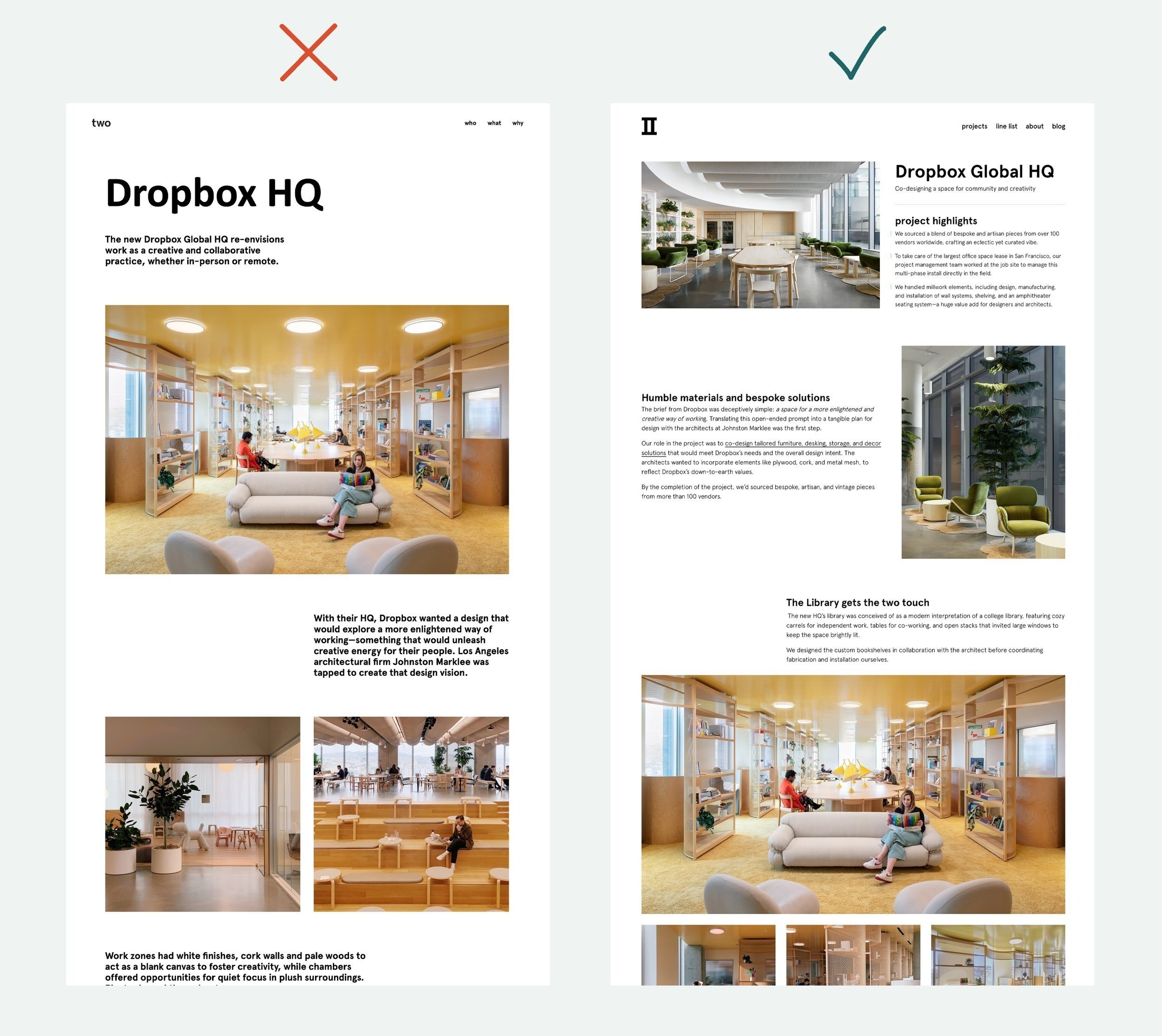
Project pages before:
Above-the-fold (very top) section of the page is not optimized to give the reader key information about two’s role and contribution to the project.
Page heading is disproportionately large.
You have to scroll down the page to see project images for context.
After
Project pages after:
Above-the-fold section is optimized with information about two’s specific contribution. It also includes an accompanying image that is fully visible for context.
Before
After
Project pages before:
Project copy does not provide specific information about two’s contribution to the project or individual spaces.
Project pages after:
Above-the-fold section is optimized with information about two’s contribution. It also includes an accompanying image for context.
Individual sections are organized around images of individual spaces, including copy about two’s work in each of these areas.
Subheadings throughout the page guide the reader and make the page “skimable” for visitors who want a high-level overview.
4. Pinterest account optimization and ongoing content
Part of two’s content ecosystem included Pinterest posts for each of the images from their project pages.
Since new project pages included descriptions of specific spaces, it was easy to adapt this copy for post captions while ensuring optimized long-tail keywords were also included.
But, before jumping into posts we updated their account organization.
Before
After
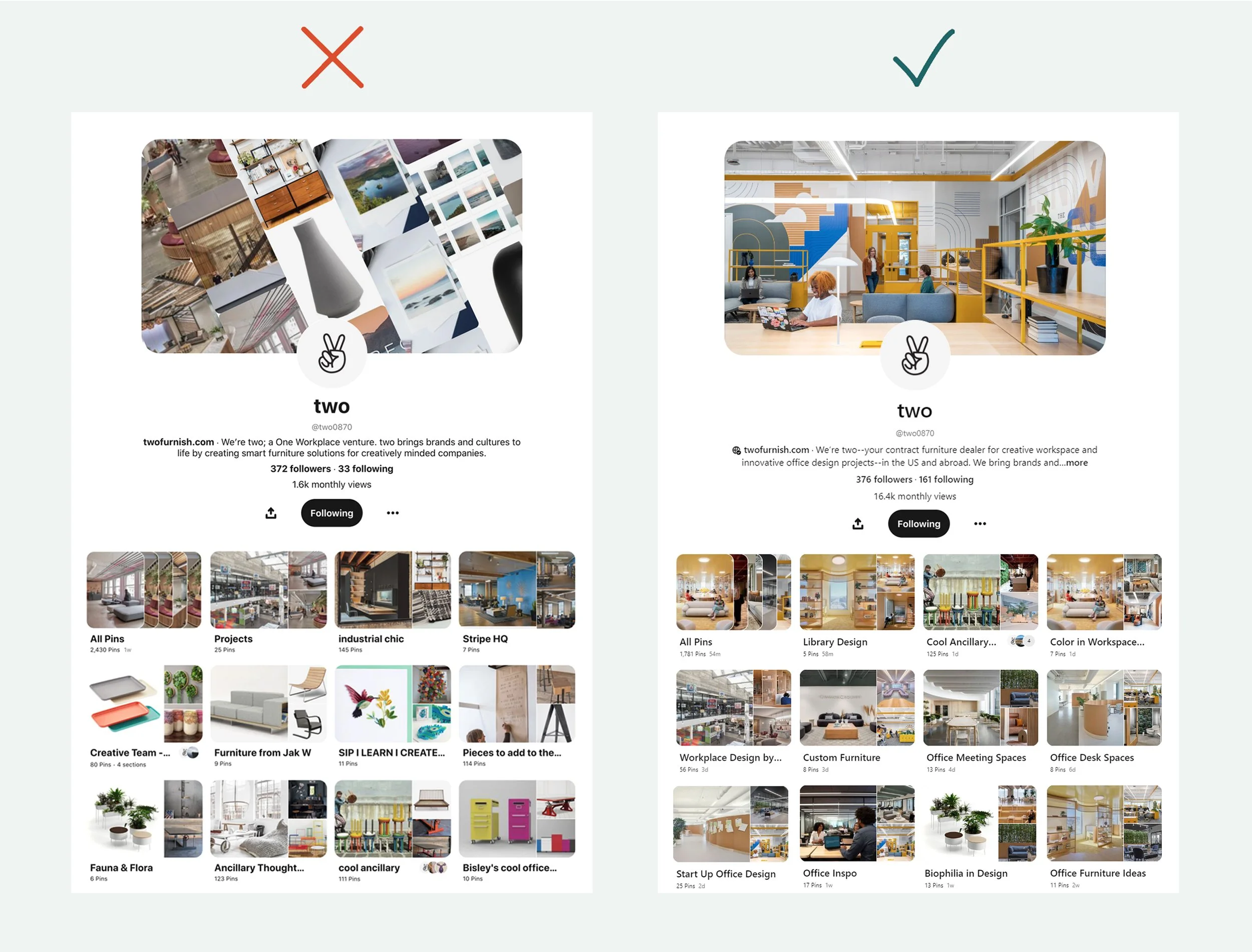
Pinterest account before:
1.6k monthly views (when we started)
Banner is a random auto-selection of images and doesn’t represent the two brand.
Far too many public boards, including boards that should be private for internal work only.
Pinterest account after:
16.4k monthly views (after 9 months of our work)
Banner is a compelling image of a marquee project that can be updated as needed.
Public boards largely include images of two projects and are titled with Pinterest SEO keywords.
5. Regular Instagram content that highlights two’s creativity, technical chops, and company initiatives
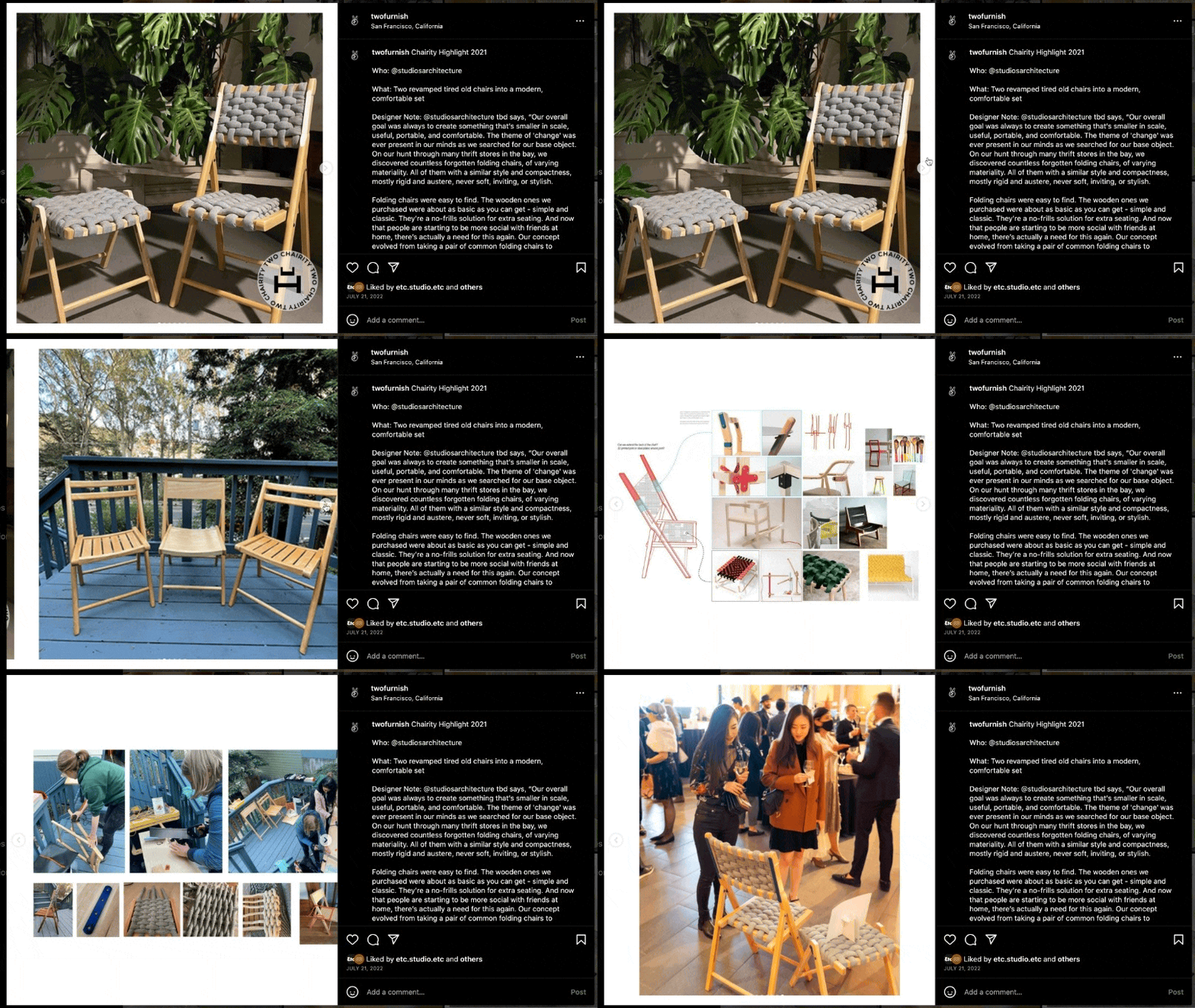
Our work included posts about the design and construction process for custom pieces as well as posts about two’s annual fundraising + design competition event, Chairity.
6. LinkedIn content that showcases two’s most recent projects
For each new project page, we created an accompanying LinkedIn post. This way, two’s internal marketing team could easily plug project-specific content into their LinkedIn posting schedule.
7. Monthly newsletters that feature new projects, partners, and company initiatives
two has a large list of industry contacts, clients, and new leads. However, they did not have a system in place to engage each of these people on a regular basis.
We developed a newsletter template and strategy to ensure two would stay top-of-mind for their clients and industry contacts.
Let’s work together
We’ve helped businesses that work in design and the built world tell stories for growth. Tell us a bit about your company and what you’re looking for.
We’ll get back to you right away.


